
Unit Content - Card Grid
The Unit Content – Card Grid component can present text in two- or three-card formats. Card grids are commonly used with images or “cards” above headings and text with each grid item linking off to a subpage. Other options are embedding videos or image galleries in the card spaces or adding a button rather than linking the whole card.
On This Page
Examples
-
Card Grid Item One
Lorem ipsum dolor sit amet, consectetur adipiscing elit, sed do eiusmod tempor incididunt ut labore et dolore magna aliqua. Ut enim ad minim veniam, quis nostrud exercitation ullamco laboris nisi ut aliquip ex ea commodo consequat.
-
Card Grid Item Two
Lorem ipsum dolor sit amet, consectetur adipiscing elit, sed do eiusmod tempor incididunt ut labore et dolore magna aliqua. Ut enim ad minim veniam, quis nostrud exercitation ullamco laboris nisi ut aliquip ex ea commodo consequat.

Two Item Grid / No Animation / with Photos / Page Links / Serif
-
Card Grid Example One
Lorem ipsum dolor sit amet, consectetur adipiscing elit, sed do eiusmod tempor incididunt ut labore et dolore magna aliqua. Ut enim ad minim veniam, quis nostrud exercitation ullamco laboris nisi ut aliquip ex ea commodo consequat.
-
Card Grid Example Two
Lorem ipsum dolor sit amet, consectetur adipiscing elit, sed do eiusmod tempor incididunt ut labore et dolore magna aliqua. Ut enim ad minim veniam, quis nostrud exercitation ullamco laboris nisi ut aliquip ex ea commodo consequat.
Two Item Grid / No Animation / without Photos / Button Links / Sans
-
Video Link
Lorem ipsum dolor sit amet, consectetur adipiscing elit, sed do eiusmod tempor incididunt ut labore et dolore magna aliqua.
-
Another Video
Lorem ipsum dolor sit amet, consectetur adipiscing elit, sed do eiusmod tempor incididunt ut labore et dolore magna aliqua.

Two Item Grid / with Animation / with Photos / Video Links / Sans
-
Image Gallery
Sed ut perspiciatis unde omnis iste natus error sit voluptatem accusantium doloremque laudantium, totam rem aperiam, eaque ipsa quae ab illo inventore veritatis et quasi architecto beatae vitae dicta sunt explicabo.
-
Another Gallery
Sed ut perspiciatis unde omnis iste natus error sit voluptatem accusantium doloremque laudantium, totam rem aperiam, eaque ipsa quae ab illo inventore veritatis et quasi architecto beatae vitae dicta sunt explicabo.
-
More Images
Sed ut perspiciatis unde omnis iste natus error sit voluptatem accusantium doloremque laudantium, totam rem aperiam, eaque ipsa quae ab illo inventore veritatis et quasi architecto beatae vitae dicta sunt explicabo.










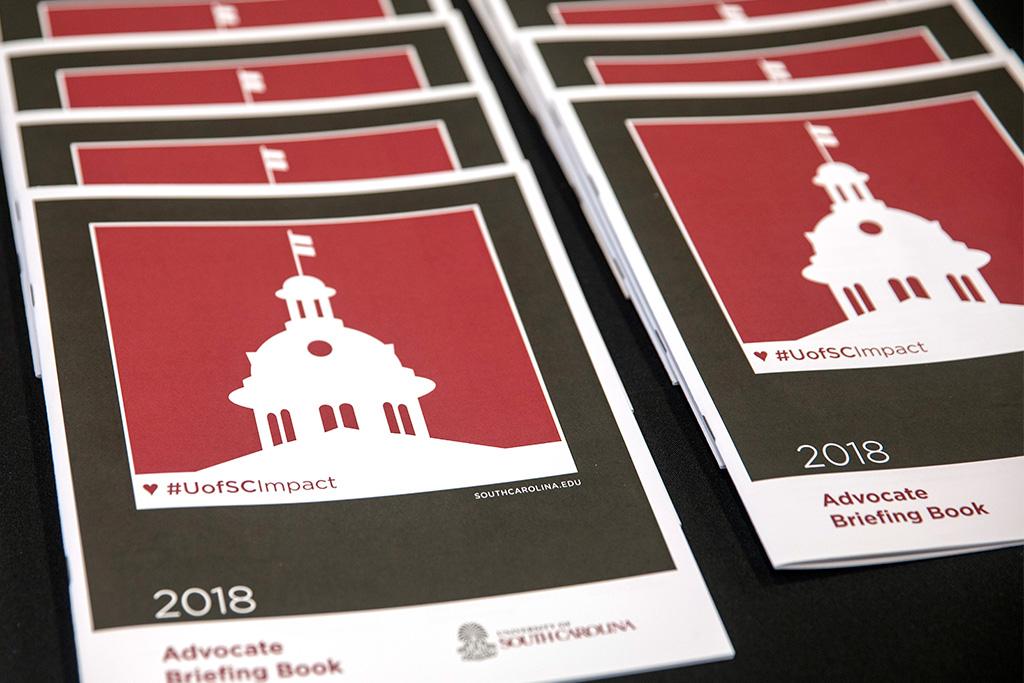
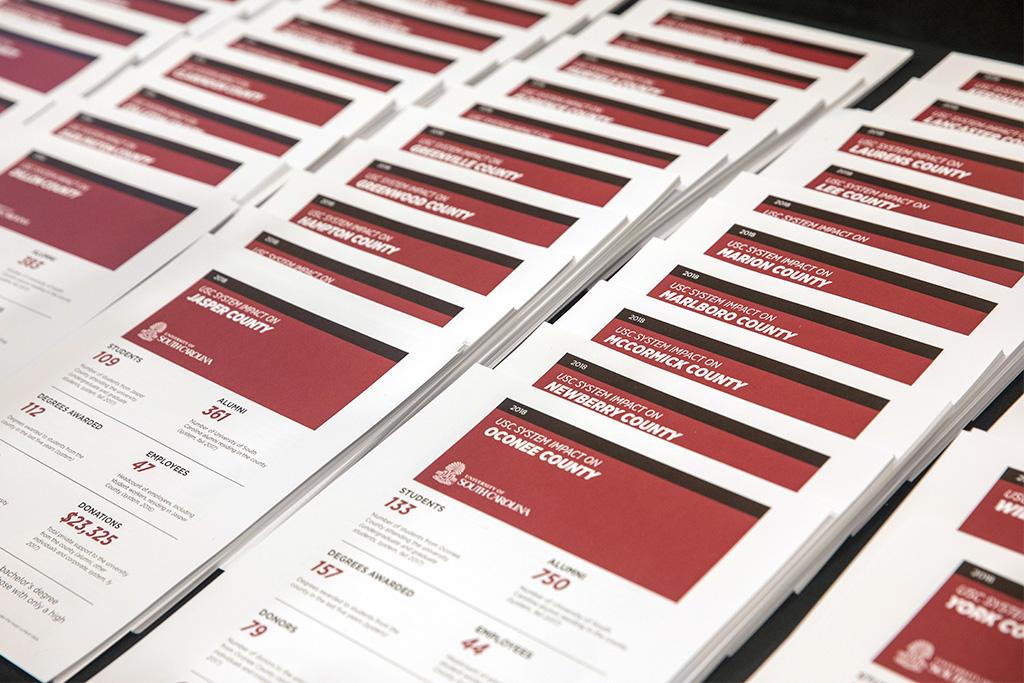
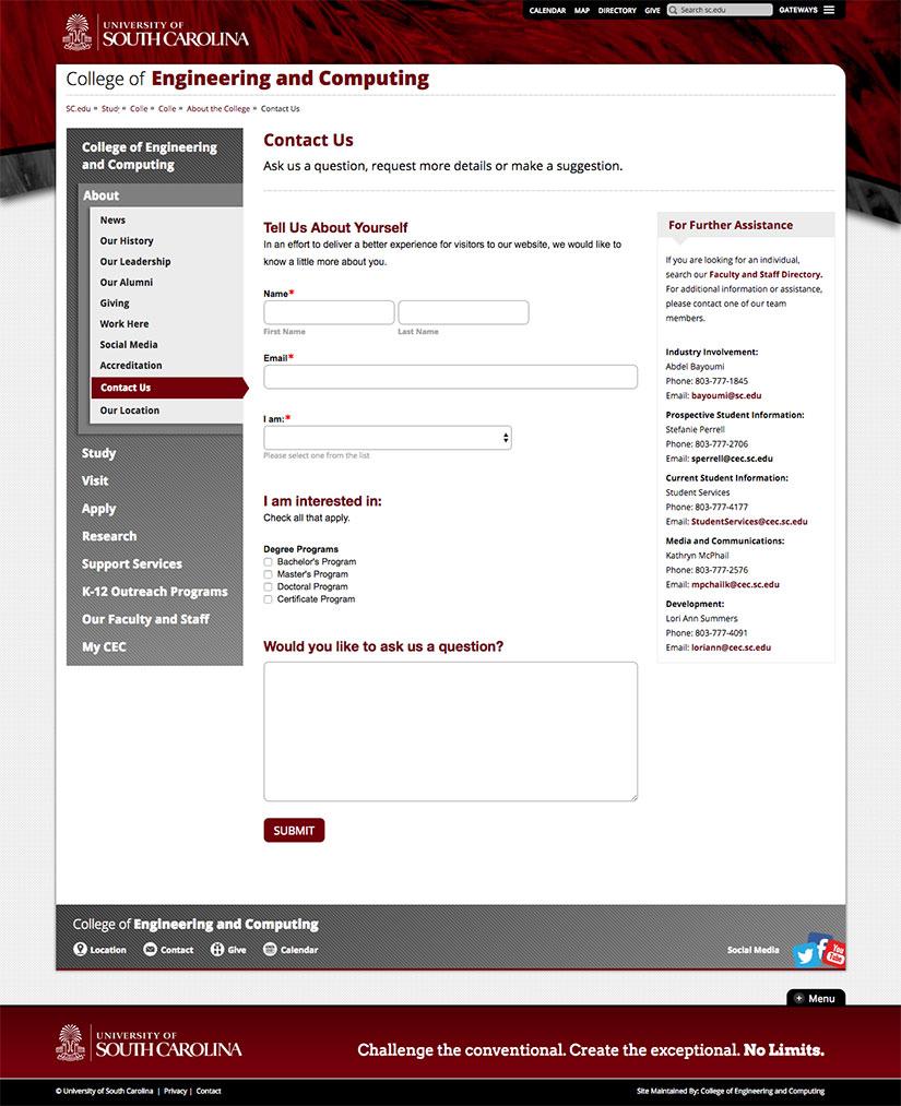
Three Item Grid / No Animation / with Photos / Asset Links / Serif
-
Example One
Sed ut perspiciatis unde omnis iste natus error sit voluptatem accusantium doloremque laudantium, totam rem aperiam, eaque ipsa quae ab illo inventore veritatis et quasi architecto beatae vitae dicta sunt explicabo.
-
Example Two
Sed ut perspiciatis unde omnis iste natus error sit voluptatem accusantium doloremque laudantium, totam rem aperiam, eaque ipsa quae ab illo inventore veritatis et quasi architecto beatae vitae dicta sunt explicabo.
-
Example Three
Sed ut perspiciatis unde omnis iste natus error sit voluptatem accusantium doloremque laudantium, totam rem aperiam, eaque ipsa quae ab illo inventore veritatis et quasi architecto beatae vitae dicta sunt explicabo.
Three Item Grid / No Animation / without Photos / Page Links / Sans
-
This Page
Sed ut perspiciatis unde omnis iste natus error sit voluptatem accusantium doloremque laudantium, totam rem aperiam.
-
This Page Again
Sed ut perspiciatis unde omnis iste natus error sit voluptatem accusantium doloremque laudantium, totam rem aperiam, eaque ipsa.
-
The Example Page
Sed ut perspiciatis unde omnis iste natus error sit voluptatem accusantium doloremque laudantium.
Three Item Grid / No Animation / with Photos / Button Links / Serif
Settings & Features
- Component set up:
- 2 or 3 column grid items
- Sans or serif heading
- Static or animated
- Styling choices per grid item:
- Image (2 card - 1200 x 700 pixels or 3 card – 1200 x 1200 pixels)
- Heading text (character limit 30-50 including spaces)
- Description (character limit 200-250 including spaces)
- Linking behavior: Entire grid item or button only; Also link to a video or asset
Working with Content
Good for:
- Large group of items
- Items that have strong, similarly composed imagery
Avoid if:
- Any items are missing images
- Images are not strong
- Images will be mixed in tone, composition or style
Best Practices
- Link either the entire grid item OR use a button, not both.
- Images should be similar stylistically (not mixed) — subject sizing, crop, all color or b&w, all photo, icon or no image.
- Make description text brief and similar lengthwise.
- Descriptive text should differentiate the items and provide context to linking page.
- If the card links to a video or a gallery of images, set that context in the description or button, if used.
Usability & Guidelines
- Videos will automatically have a play button added by the CMS.
Alternative Options
If images are missing, weak or lacking for any of the items, consider another type of component for better usability, accessibility and maintenance.
| Content Need | Recommended Component |
|---|---|
| Group of items (some images) | Card grid with no images |